Pages

Monday, 2 December 2013

Module 1, Chapter 2–Printing onto Coloured Papers

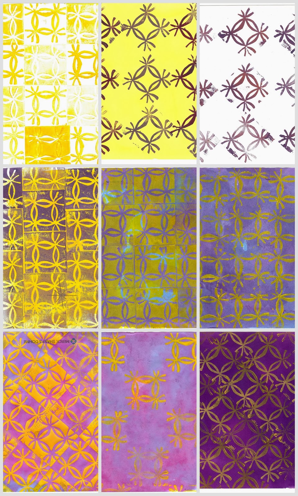
From my visual research of the new Library in Birmingham, I made a a print block from fun foam which I carefully cut with a scalpel – this enabled me to make relatively fine detail, and also to make a second block from the piece I’d cut so I had both a positive and negative of the motif.
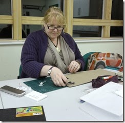
hard at workHere I am hard at work looking rather serious, mounting the cut out foam blocks onto some thick card.printing


drying
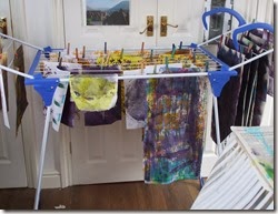
I used a roller to apply acrylic paint to the print blocks to give it a more even coat of paint. I had quite a session of it as you can see – I used a clothes airer to hand the papers to dry as I have limited table space, and this allowed me to keep printing while I had all the paints on the go.
When using a roller you tend to have loads of spare paint on it, so after I finished printing, rather than wash it all down the sink, I kept rolling onto any piece of paper I could get my hands on, using different angles, pressure and ends of the roller for different effect – Also into my sketch book pages – I basically rollered everything in my path and Winking smileit’s a good job himself was out or he may have had a coating too!
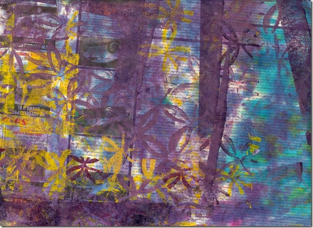
I also kept the paper I had used underneath as I was sloshing and printing which had some pretty interesting marks by chance, and will I’m sure come in handy for some collage at a future date. Here’s an A4 section of this ‘drip sheet’ below.
drip sheet
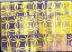
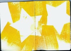
Here are a couple of pages of my sketchbook (A5 opened out to A4). I used up the paint on my stamp and then added a wash of colour once it was dry (below right), and I used a paper star shape as a mask and roughly rollered over the top to use up the paint.
sketchbook pagestar rollering
A happy accident – I the star I used as a mask (below) looks highly decorative in its own right – I used the roller after having dabbed my stamp direct to the pallette numerous time, and these imprints were transferred to the roller and on to the paper – you can just make out some ghostly marks form the print block.
star mask

Here are a selection of some of the more successful pieces

Assorted patterns on A4 Sheets using acrylic paint and procion dye washes

Module 1, Chapter2 - Making Coloured Papers

I chose the complimentary colour scheme of purples & yellows that was suggested by the image of Gaudi's La Sagrada Familia in Barcelona which I found as part of my visual research. Using procion dyes I coloured up a range of papers I had to hand including cartridge, tissue, thick brown & printer copy papers.

collage

I only had a small sponge so as well as using this I applied the dyes with large brushes & scrunched up fabric. I let the pages get pretty wet so I could encourage the colours to run by lifting up the edge. This also enabled transfer of the wet dyes onto other papers which were pressed onto the wet sheets.

browwn papercling filmcopy paper creasedhater splashessalttissue paper

The above papers have been scanned with an A4 scanner - Clockwise from top left:
  1. brown paper, creased – the colours look very different to when applied to white or cream papers.
  2. cling film wrinkled over wet page – subtle textural marks
  3. copy paper crunched up a few times before and inbetween applications of layers of dyes
  4. tissue paper smoothed over wet page of cartridge paper to transfer colour
  5. rock salt applied to wet page to form ‘halos’ – I’d used the salt previously which had absorbed some colour that then transferred to make colour dots
  6. dripping of dye onto surface, tilting to encourage running.

Thursday, 28 November 2013

Barkcloth to Artcloth Project

I have made a rather last minute contribution to a decorated piece of barkcloth for the Barklcoth to Artcloth project. - a collaboration between Textile artist Bobby Britnell and shoe designer Janet Middleton to promote awareness of the 'Hands Up for Uganda' Charity. 
The idea is to for various contributing textile artists & enthusiasts to create embellished pieces of Barkcloth from Uganda which Janet then makes into shoes (art shoes not functional). These will then be exhibited  at the forthcoming ICHF (International Craft & Hobby Fair). You can find out more about this, and see some of the inspired creations here on their facebook page.
Sian Martin (my tutor) has asked Distant Stitch students to all contribute a feather which will  then be applied to a embellish a piece of the barkcloth, and here's my little offering. I used a piece of my hand dyed cotton which had a bit of patterning that looked featherish. I used stitch and tear to stabilise it so I could free machine the feather shape. Then I cut it out, leaving plenty of edging around the sides and particularly the tip so I could fray this back to the stitch line. It's about 9cm long including the frayed tip.

Monday, 23 September 2013

And so it begins....Module 1, Chapter 1

Stars & Crosses - what's in a shape?

It's quite difficult to describe the difference between the 2 different shapes as they are in many ways similar and interrelate to some extent - e.g. a cross could be an element of a star shape. However the main defining factor is I guess that crosses consist of usually 2 lines (or rectangular type shapes) that intersect, where 1 line cuts across the main one. There are more complex crosses such as the Russian Orthodox Cross which has several lines cutting across the main line.
Russian Orthodox Cross

 Whereas stars consist of a number of lines (or shapes) that radiate from a focal, though not necessarily central, point.
 
Although the difference is slight, both the overall effect and cultural meanings can be very different. Both crosses and stars are used in religious imagery of many religions - sometimes both in the same religion - for eg Christianity uses both the cross (crucifixion) and star (star of bethlehem). I am not actively religious, but even so am a product of a  western  predominantly (once?) christian society and this inevitably shapes my perception of the meanings of these shapes. When I consider stars or crosses I think that crosses often have more 'heavy' and/or negative associations such as:
  • death & suffering
  • bleakness
  • failure, regret - cross out or delete
  • being at a crossroads - means difficult decisions to make and inevitable change/loss of existing way of life. 
  • negative feelings - such as being cross
Stars on the other hand hold much more positive meanings for me such as:
  • hope - a star shining in the dark
  • destiny and adventure - follow the stars
  • warmth & sunshine
  • vibrancy & life
  • success, recognition, desirability, star quality
So.....it will perhaps be no surprise that I have decided to focus on stars for this module :)

Visual research

I have started by collecting a number of 'pins' on Pinterest - you can see my pin board here. No doubt I'll carry on adding to this if I see something that grabs me.


Pinboard 1 - Rustic & Folk


I've also gathered a number of images from magazines, wrapping paper, fabric, a few of my own photos and a couple of rubbings. These have been arranged  onto 2 x A3 size 'pinboards' I seem to have got 2 basic themes going on - pinboard 1 shows rustic & folk type stars including Scandinavian style shapes, whereas board 2  shows more structures, architectural style shapes.


Pinboard 2 - Architectural Star Shapes
I love the simplicity of rustic shapes, but also the more structured and complex shapes on my 'architectural' board. Also I like the purple and yellow complementary colour scheme that seems to have emerged on the right hand side of pinboard 2.


Exploring Colour

I compiled a colour wheel using designers gouache paints. I use both warm and cool primary colours of red, blue and yellow for the hues, and white and black for the tints and shades.

Colour Wheel

It took a surprising long time for me to mix the colours, but in doing so I learned a few things:
  • lighter toned colours like yellow are quickly overwhelmed by darker colours red, blue & black.
  • warm red will never make a clear purple - a cool red is needed for this
  • black and yellow make a greeny colour

Colour Mixing Notes
I've also completed a number of line drawings in my sketchbook (A5, opens to A4 double page spread) to further explore some of the star shapes I have gathered, and am still keeping an eye out for more which will no doubt work it's way into my work as it evolves.
assorted star line drawings


exploring the pattern on the exterior of new Birmingham library
I recently had a jaunt to Birmingham with some friends and was fascinated by the external decoration of the new library there, so had a play with this in my sketchbook

picking out starshapes from Brimingham library