Pages

Tuesday, 18 February 2014

Module 1, Chapter 3 continued

Design Sheet B

This set of exercises  explores differences in scale, arranging and/or interlinking shapes to make new units or borders. I worked to one of my A3 sized sketchbook pages and added another A3 page as an extension  which I'll be able to fold in when a re-attach the page to the book.

 I continued to use my 2 motifs from my original research collection - a danish or patchwork style star and the star shapes I generated from images of the new Birmingham Library.


 Exercise 1 involved making a simple design using small and large versions of the same shape. I have also used both positive and negative versions of these.


Exercise 2 involved using these 2 different sized shapes to make a repeat pattern.
Border 1


Exercise 3 then involved a play to use my shape to make a continuous border and navigate this around a 90 degree corner, and here are the 2 versions I came up with.
Border 2

Linking Border


I then moved on to Exercise 4 which involved interlinking shapes to make a linking border. Due to the frondy bits on my shape this made for quite a congested and less than attractive effect. So I spaced them out by adding a different shaped link which was cut from part of a negative shape of the larger scale version, which  I think proved much more successful.


Exercise 5 was concerned with linking 2 different shapes and/or scale in an interesting way. I linked a shape derived form my Danish Stars to link with my Birmingham Library stars


Linking two different shapes 1
Linking two different shapes 2
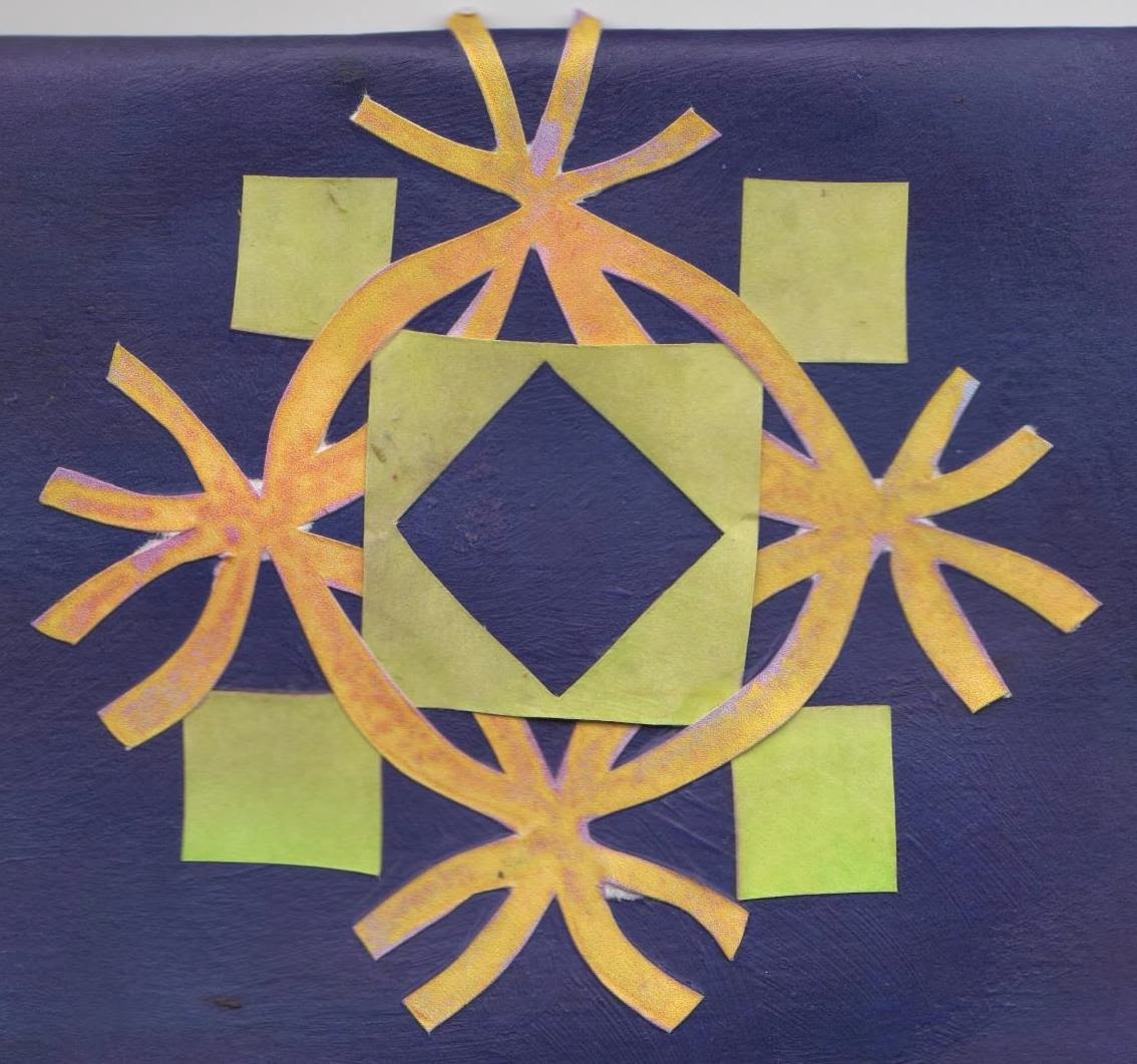
Linking two different shapes 3


Exercise 6 - Making a new shape from old

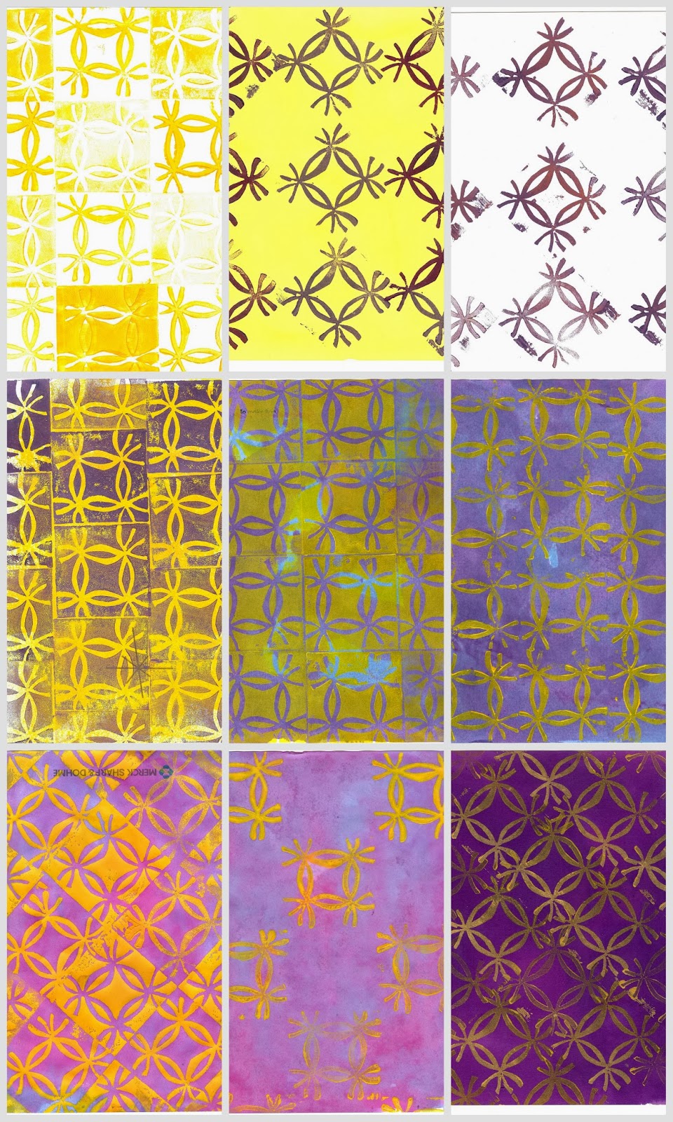
My Birmingham star was cut into a different shape derived form the Danish Star. Swapping the colours around makes for quite a different effect.

Original shape


Positive and Negatives of new shape in different colours


 My last experiment involved placing the negative shape of my star over a printed sheet - a kind of reverse of the above process in. This produces a layered effect which  is akin to my observations of the actual library as there are a number of layers of variations of the star shapes as I have studied with my drawing.


As you can see these exercises have meant a whole lot of cutting out of individual shapes and I have to confess there were times when I rather regretted my choice of shape which is rather fiddly to say in the least - but I feel it was worth the effort as I think it makes for some interesting design developments.


Time logged for this activity - 9.5hours


Sunday, 16 February 2014

Birmingham Library - further exploration of design ideas

Drawing made by isolating an area from pictures of the Birmingham library decorative surface using 2 card L's as a viewfinder.  This makes for more dynamic star shapes, and shows a layering of these shapes of varying scale which adds depth & movement. The original photo  was taken at an angle so the shapes appear pleasantly distorted and less regular/formal.

Graphite stick, sketched into with eraser, and worked back into with pencil to add darker tones and definition.

Monday, 27 January 2014

Module 1, Chapter 3 - Design Development of Star Shapes


Design Sheet A
This set of exercises  explores positive & negative shapes, counterchange, symmetry/asymmetry and distortion. I worked to one of my A3 sized sketchbook pages and added an A4 extension which I'll be able to fold in when a re-attach the page to the book.


I used 2 motifs from my original research collection - a danish or patchwork style star and the star shapes I generated form my photo of the new Birmingham Library.


Exercise 1 involved counterchange of colour and also positive & negative shapes. It is striking the different effect this can make.


For exercise 2 I have taken a modified version of the negative Danish/patchwork shape to use as my 'positive' shape and placed them together to form another negative ahpe in the middle.


Exercises 3,4, & 5 involved exploring symmetry, assymetry and distortion which is a great way to modify and stylise shapes.

No. 5 shows the use of the Fibonnacci series to gradually increase the amount of distortion from a central point, giving the impression of perspective.


Exercise 6 involved distorting the star shape into a different shape i.e. circle, triangle and diamond. I drew the shape freehand into the 'new' shape.


My 'library' star is not strictly symmetrical, and neither were my distorted shaped versions - however if they were then my repeat patterns made in exercise 7 (below) would have worked a bit more seamlessly.


Using a simpler shape would have been a lot less fiddly to cut out, but I think it is quite effective when repeated in this way and makes quite complex star shapes.

To speed up the process a little the repeat of triangles was made by scanning in the image, copying and pasting multiple times onto a sheet of paper before cutting out each triangle and assembling.


Time logged for this activity - 7 hours

Monday, 6 January 2014

Module 1, chapter 2 - Star shapes from coloured papers

A3 sheet of paper

Here I have made a collection of star shapes from coloured papers using a number of techniques. I used a simple craft punch shape in 2 sizes to cut the stars on the far left, putting multiple shapes togther to form more complex shapes. Other techniques employed are tearing and cutting with a range of tools (scissors, pinking sheers, scalpel). I have enjoyed having a play with combining various components taken from my original research. some of the shapes are quite precise and structured, while with others I have enjoyed using a looser and less detailed approach.

Monday, 2 December 2013

Module 1, Chapter 2–Printing onto Coloured Papers

From my visual research of the new Library in Birmingham, I made a a print block from fun foam which I carefully cut with a scalpel – this enabled me to make relatively fine detail, and also to make a second block from the piece I’d cut so I had both a positive and negative of the motif.
hard at workHere I am hard at work looking rather serious, mounting the cut out foam blocks onto some thick card.printing


drying
I used a roller to apply acrylic paint to the print blocks to give it a more even coat of paint. I had quite a session of it as you can see – I used a clothes airer to hand the papers to dry as I have limited table space, and this allowed me to keep printing while I had all the paints on the go.
When using a roller you tend to have loads of spare paint on it, so after I finished printing, rather than wash it all down the sink, I kept rolling onto any piece of paper I could get my hands on, using different angles, pressure and ends of the roller for different effect – Also into my sketch book pages – I basically rollered everything in my path and Winking smileit’s a good job himself was out or he may have had a coating too!
I also kept the paper I had used underneath as I was sloshing and printing which had some pretty interesting marks by chance, and will I’m sure come in handy for some collage at a future date. Here’s an A4 section of this ‘drip sheet’ below.
drip sheet
Here are a couple of pages of my sketchbook (A5 opened out to A4). I used up the paint on my stamp and then added a wash of colour once it was dry (below right), and I used a paper star shape as a mask and roughly rollered over the top to use up the paint.
sketchbook pagestar rollering
A happy accident – I the star I used as a mask (below) looks highly decorative in its own right – I used the roller after having dabbed my stamp direct to the pallette numerous time, and these imprints were transferred to the roller and on to the paper – you can just make out some ghostly marks form the print block.
star mask

Here are a selection of some of the more successful pieces

Assorted patterns on A4 Sheets using acrylic paint and procion dye washes

Module 1, Chapter2 - Making Coloured Papers

I chose the complimentary colour scheme of purples & yellows that was suggested by the image of Gaudi's La Sagrada Familia in Barcelona which I found as part of my visual research. Using procion dyes I coloured up a range of papers I had to hand including cartridge, tissue, thick brown & printer copy papers.

collage

I only had a small sponge so as well as using this I applied the dyes with large brushes & scrunched up fabric. I let the pages get pretty wet so I could encourage the colours to run by lifting up the edge. This also enabled transfer of the wet dyes onto other papers which were pressed onto the wet sheets.

browwn papercling filmcopy paper creasedhater splashessalttissue paper

The above papers have been scanned with an A4 scanner - Clockwise from top left:
  1. brown paper, creased – the colours look very different to when applied to white or cream papers.
  2. cling film wrinkled over wet page – subtle textural marks
  3. copy paper crunched up a few times before and inbetween applications of layers of dyes
  4. tissue paper smoothed over wet page of cartridge paper to transfer colour
  5. rock salt applied to wet page to form ‘halos’ – I’d used the salt previously which had absorbed some colour that then transferred to make colour dots
  6. dripping of dye onto surface, tilting to encourage running.

Thursday, 28 November 2013

Barkcloth to Artcloth Project

I have made a rather last minute contribution to a decorated piece of barkcloth for the Barklcoth to Artcloth project. - a collaboration between Textile artist Bobby Britnell and shoe designer Janet Middleton to promote awareness of the 'Hands Up for Uganda' Charity. 
The idea is to for various contributing textile artists & enthusiasts to create embellished pieces of Barkcloth from Uganda which Janet then makes into shoes (art shoes not functional). These will then be exhibited  at the forthcoming ICHF (International Craft & Hobby Fair). You can find out more about this, and see some of the inspired creations here on their facebook page.
Sian Martin (my tutor) has asked Distant Stitch students to all contribute a feather which will  then be applied to a embellish a piece of the barkcloth, and here's my little offering. I used a piece of my hand dyed cotton which had a bit of patterning that looked featherish. I used stitch and tear to stabilise it so I could free machine the feather shape. Then I cut it out, leaving plenty of edging around the sides and particularly the tip so I could fray this back to the stitch line. It's about 9cm long including the frayed tip.